Home » News & Resources » Experience Design » Going Dark Mode on Your Website

Going Dark Mode on Your Website
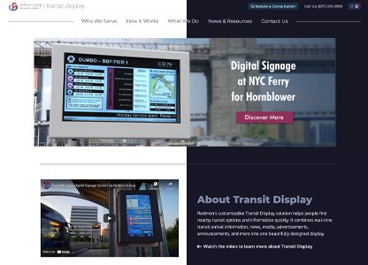
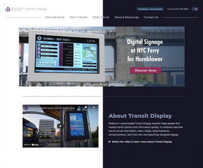
You probably have seen on your computer or social media apps the option “dark mode”. This setting allows to view your screen with a dark theme.

Going Dark on Your Website
You probably have seen on your computer or social media apps the option “dark mode”. This setting allows to view your screen with a dark theme.
Going Dark Mode on Your Website
Published: 01/15/2022

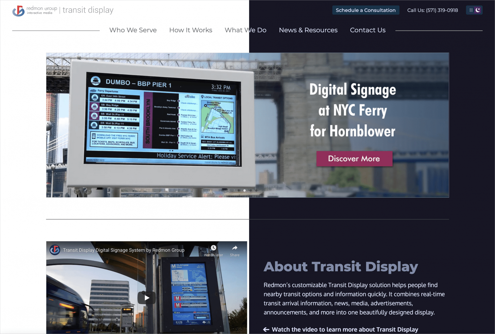
You probably have seen on your mobile device, computer or social media apps the option “dark mode”. This setting gives you the option to view your screen with a dark theme, predominantly black background with white text.
This trend has become increasingly popular as an option on browsers and social media apps. Even websites offer a “switch” button to choose which “mode” the website should display. But, is this just a fleeting trend, or is there a useful purpose to this?
On an aesthetic level, websites with black background and light color text can help enhance the features of the website. Visuals enhance; giving your website some “pop”.
On a usability level, it depends on the content of your website. If your website is mostly content with limited visuals, it may not be necessary to implement this mode. But if there are images, features with color that needs to stand out for your audience, it would be a great option to have. It is also easier on the eyes according to usability and user experience studies.
Health Benefits
Healthwise, some experts believe dark mode can cause less eye strain on the users; and more visually appealing when your audience is looking at your website from their mobile devices at night. Other experts think the opposite due to eye pupils growing in size hence needing to focus more. Whether dark it is better or worse when it comes to eye health, the jury is still out and it might be more of the user’s preference and how it impacts their eyes.
Let’s also consider battery health. Using dark mode can help preserve your device’s battery life; comparing to bright white backgrounds consuming more of it.
When to apply Dark Mode
Although there are browser extensions that attempt to apply “dark mode” to any website, such as Chrome’s NightEye, the results can be unpredictable, and not visually appealing. By taking control of this by adding this feature as part of your website design (or maintenance), you would have control of the look/feel.
The dark mode can be a great option to add to your website since users are accustomed to this preference everywhere, from their computer display settings, to apps and even browsers. And this can also impact in a positive way user experience; and minimize user complaints about your website.
Worried about how SEO would handle the dark theme? It will not affect your site’s SEO as long as you have considered all the usability aspects, which we can help with.
At Redmon, our team of experts can design, or enhance your existing website to include the feature of “dark mode” taking any consideration in terms of usability, accessibility and with user experience in mind.
Categories
Digital LearningExperience Design
SEO Tips
User Experience
Website Development
Transit Display
AV Integration


